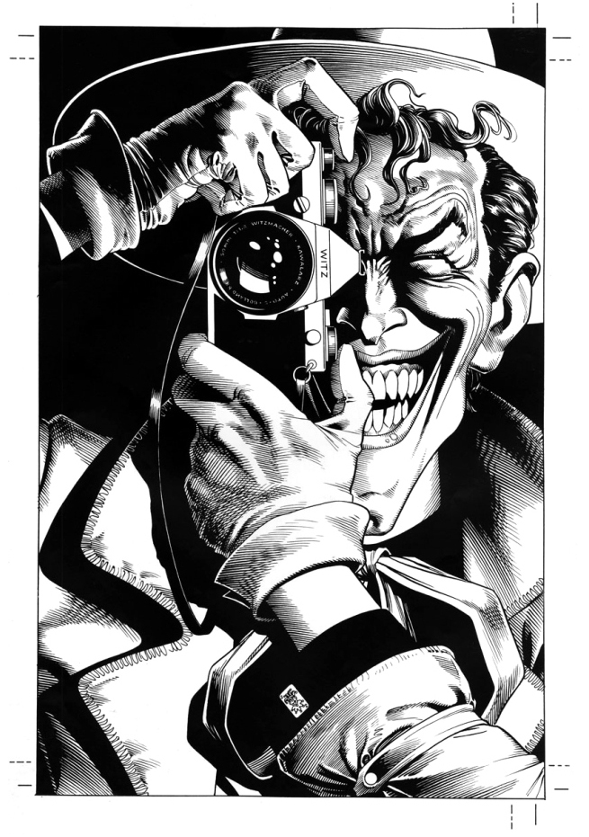
 “Brian Bolland did a wonderful job on the art but I don’t think it’s a very good book. It’s not saying anything very interesting.” – Alan Moore
“It’s probably well known that John’s choice of colors turned out to be startlingly at odds with what I had in mind” – Brian Bolland
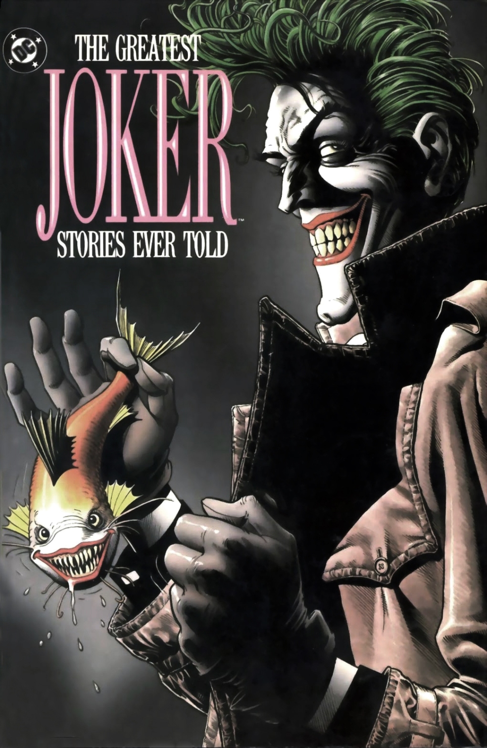
Context: Tim Burton’s Batman came out in 1989 and got lots of kids picking up comic books for the first time, me included. My dad brought me to a comic shop he had found during a lunch break and bought me The Greatest Joker Stories Ever Told (seen below). It had a cover by Brian Bolland, which looked great. But to my disappointment none of the art inside, which was all drawn by different cartoonists was as good as that cover. A few months later I saw The Killing Joke on the shelf, fully illustrated by Bolland and written by Alan Moore. Thirty-seven of its forty-eight pages feature drawings the Joker. And as much (or as little) as that sounds it solidified Bolland as the definitive artist for the character.
When The Killing Joke came out the superhero revolution had happened a few years before with Frank Miller doing The Dark Knight Returns and Alan Moore on Watchmen. Both books brought a darker perspective on the superhero genre, which influenced Burton’s take on it and flooded the market with violent, gritty anti-heroes. Bolland was unhappy about its final color treatment by John Higgins and Moore (who generally likes bigger more far reaching ideas) felt a smaller story between the iconic Gotham characters didn’t lead to anywhere interesting. No big ideas. Interesting to see a book loved by so many but looked down upon by its creators. Moore has pretty much disowned it and Bolland got to recolor it the way he originally intended in a 2008 deluxe edition re-release.
Story: The Joker escapes from Arkham Asylum, takes over an old dilapidated Carnival playground and terrorizes Gotham with a simple premise – all that’s needed for someone to snap and go insane is one bad day. That everyone is one bad day away from being like him. He chooses to prove his point by singling out the commissioner as his test subject, first crippling his daughter with a shot to the spine and then submitting Gordon through a series of humiliating events and eventual witness to his daughter’s horrific suffering. Throughout the story we are shown several flashbacks that propose to be the Joker’s origins: the one bad day that lead him from being a normal husband who is trying to support a pregnant wife, into a green haired sociopath.
CARTOONING
Influence and background: Like many cartoonist of his time Bolland was heavily influenced by the superhero visions of George Perez, Joe Kubert and Neal Adams. Adam’s cover for Batman issue 251 has been noted as a direct influence on him to want to draw a Joker story. Bolland’s art school background aligned itself with creating art that had, as its foundation a deep understanding of anatomy and perspective – something not easily found in a lot of comics art. Early work includes finely crafted black and white pages for Judge Dredd and British sci-fi magazine magazine 2000 AD. And along with British artists Dave Gibbons and Brenden McCarthy, Bolland broke into the American comics market in the eighties but now has the luxury of mostly only doing comic covers. He has stated that after working with the best (Alan Moore) on Killing Joke, it would only be a step back to draw any stories for anyone else.
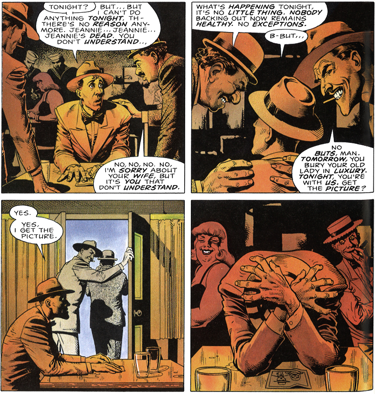 Look and feel: I’m flipping through the book and surprisingly enough my first reaction is that it’s all very normal looking. Nothing too obtrusive, panel after panel of un-frivolous comics pages. He must have stood out at the time in my collection because from an early beginning it was the heavily stylized art that got me picking up comics. Todd McFarlane, Rob Liefeld, Erik Larsen. Bolland stands out from all of them. In fact, that’s what saves him now – maybe it’s the fine arts background.
Lord knows I’ve spent many a teenage Friday night drawing superheroes – the “fun” stuff is always the dramatically exaggerated fight stance, the power poses. But if you learn to draw comics by reading comics you’ll only really know how to draw those kinds of dramatic moments (Todd McFarlane, Rob Liefeld, Erik Larsen) and will be completely lost when having to tell a proper story – where people have to sit at tables, open doors and walk down the street. Mapping out all that anatomy and perspective stuff is tedious, most action cartoonist avoid it as much as they can.
And the truth is that Bolland draws those small moments with as much focus and detail as the more grandiose ones. All within a very structured grid system that trusts the story and allows for a visual system to support it rather than trying to show off. It brings a sense of reality and balance to the more fantastical elements of the story and ultimately renders it all the more terrifying because of it. Comparing it to other artwork done at the time, even next to Dave Gibon’s masterful pages in Watchmen has only solidified how strong Bolland is in Killing Joke. And I’d challenge anyone to hunt down any comics of its time and find better panel to panel cartooning in a mainstream book. It’s deceptively good.
WRITING
When I picked it up I must have had a bit more money that week because it spotted a 4.50$ cover price. Triple what a normal cover cost at the time. Right next to the price tag was a “suggested for mature readers” label, which either the shop owner didn’t see or didn’t care. At 13, I brought it home and its tone was unlike any other comics I had. To a young reader, its mix of violence and nudity was startling, revolting and titillating at the same time. A strange mix to take in. I hid it in the back of another comic and carefully placed it in my collection so that no one could see.
The smaller and more intimate design of The Killing Joke is part of what attracts me to it all. The way Moore loops up the ending as the start and vice versa, its construction is effective and condensed – not grandiose. His scripts are infamous for being completely mapped out and fully detailed when it comes to what should be drawn in each panel. I’ve read that smart cartoonists follow instructions step away and do their best to follow his vision.
I’m not a big fan of stories that explain motives and back story so much, Moore addresses this by making the Joker mention how he often remembers his past in different ways – choosing to have it as multiple-choice. This introduces the subtle idea that he’s been an unreliable narrator in portraying himself as an innocent victim of bad circumstances.
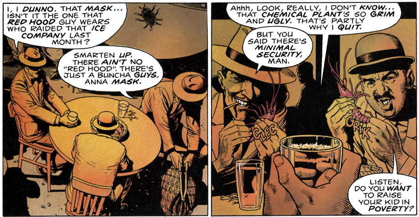
The story jumps from present to past in effective visual transitions (a part of the image always repeating itself when jumping from past to present). Some of these flashback sequences involve two gangsters and a naïve pre-Joker trying to put together a heist. These are by far the least interesting parts of the story and carry with them an amateurish tone that point towards a possible open affection for the bad acting and dialogue often found in old film noirs.
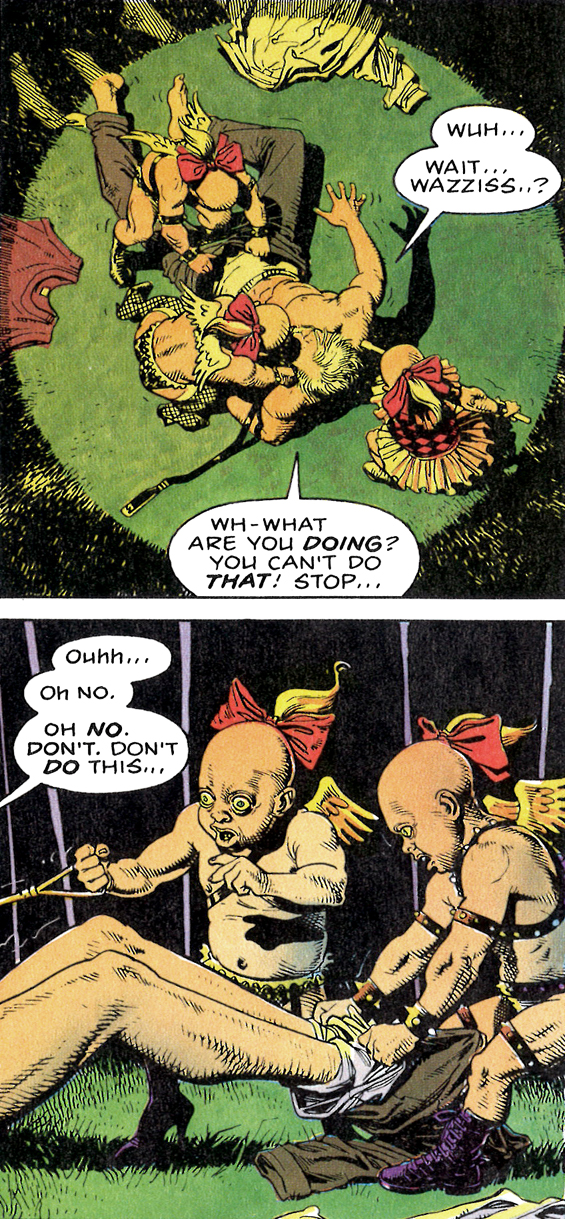
The story element that is most referred to when speaking about the book is the treatment of Commissioner Gordon’s daughter. The Joker assaults her and breaks her spine with a gunshot. The sequence in which this happens is well paced but terribly violent. It alone is jolting, but it’s the extra touch of darkness when the Joker unzips her top to take photos that gave me the feeling I was reading something I shouldn’t have been as a 13 year old kid.
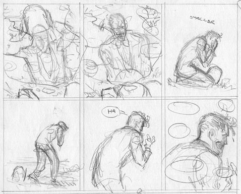
Moore now talks about the sequence as possibly being too extreme for the time, and I might not disagree. The mix of violence and titillation often seen in horror films is used to similar effects here, but looking back its darker implications give weight to Joker’s main objective. An earlier draft (above left) of the photos in question shows that they had pushed it even more with a center drawing not only suggesting nudity, but outright showing it.
THE ENDING
Even for it’s biggest supporters the ending of the book has often been a moot point. Some tolerate it, while others downright loathe it. The story climaxes with Batman saving Gordon and confronting the Joker in a fight. It ends in the same way it started, after years and years of fighting each other Batman wants to stop the cycle and genuinely reaches out to help the Joker. Man to man, one on one. It’s as tender a moment that they will have together, and with a sense of helplessness and defeat the Joker declines and offers up a joke in return:
“See, there were these two guys in a lunatic asylum… and one night, one night they decide they don’t like living in an asylum any more. They decide they’re going to escape! So, like, they get up onto the roof, and there, just across this narrow gap, they see the rooftops of the town, stretching away in the moon light… stretching away to freedom. Now, the first guy, he jumps right across with no problem. But his friend, his friend didn’t dare make the leap. Y’see… Y’see, he’s afraid of falling. So then, the first guy has an idea… He says “Hey! I have my flashlight with me! I’ll shine it across the gap between the buildings. You can walk along the beam and join me!” B-but the second guy just shakes his head. He suh-says… He says “Wh-what do you think I am? Crazy? You’d turn it off when I was half way across!”
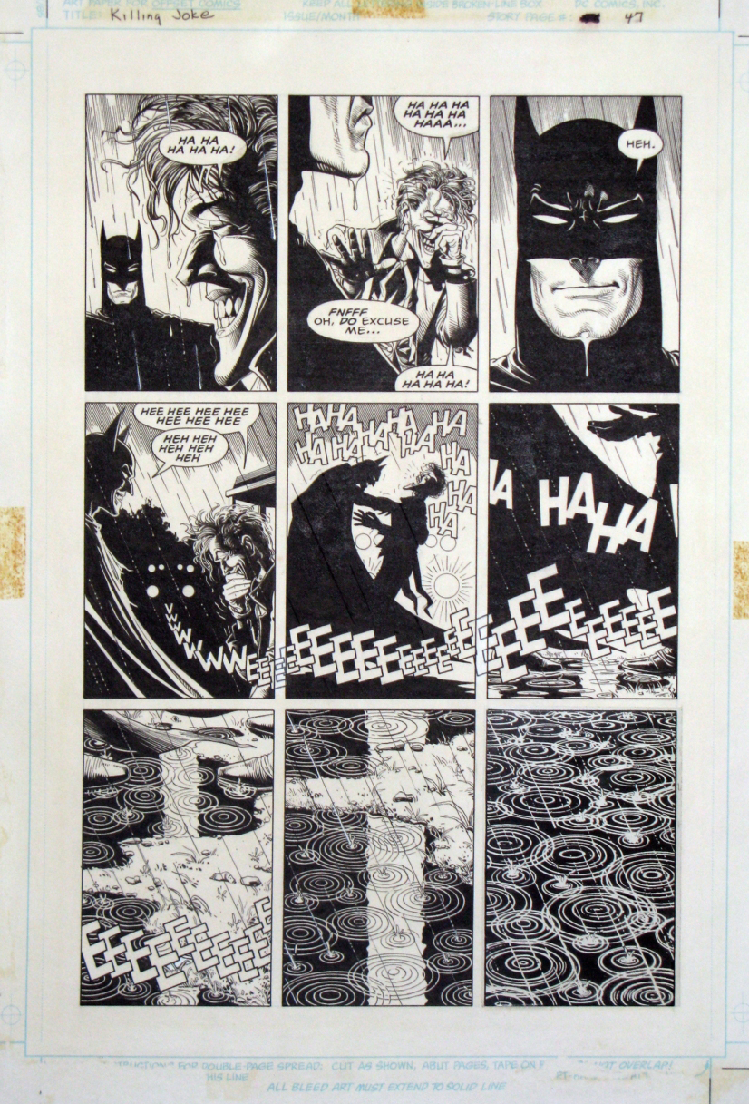
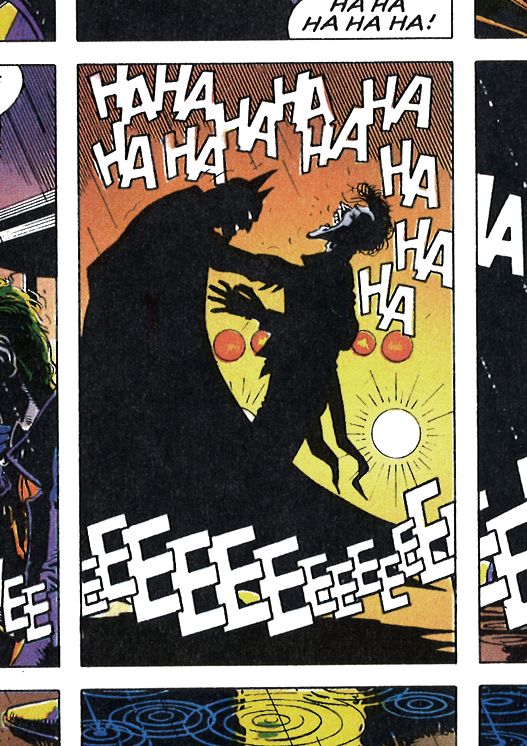
To which Batman chuckles at, and like two old friends they fall into each others arms laughing as the final panels show the police arriving to take the Joker away.
After such violence, possibly the most brutal seen in any Batman book, how could it end with Batman laughing it all off? How could Moore end his bloodbath on a joke – and one that isn’t even funny? Taken at face value the joke seems to trivialize the previous events, but its underlying message is poignant.
Dressing up like a bat and running around fighting crime is as unleveled an activity as one can think of. Certainly as odd as dressing up like a clown creating havoc on others – “two guys in a lunatic asylum”. Batman offers to reach out and help: “I have my flashlight with me! I’ll shine it across the gap between the buildings. You can walk along the beam and join me“. But the Joker sees through the well meaning gesture and points out the obvious – Batman is as crazy as he is and might not be the most solid of anchors to rely on : “Wh-what do you think I am? Crazy? You’d turn it off when I was half way across!“.
This reading of the ending satisfies me and seems fitting, but a few years back comics writer Grant Morrison (Batman Arkham Asylum) brought a whole new perspective to the ending:
“No one gets the end, because Batman kills The Joker. That’s why it’s called The KILLING Joke. The Joker tells the ‘Killing Joke’ at the end, Batman reaches out and breaks his neck, and that’s why the laughter stops and the light goes out, ’cause that was the last chance at crossing that bridge. And Alan Moore wrote the ultimate Batman/Joker story [because] he finished it. But he did it in such a way that it’s ambiguous so people will never be able to be sure, which means it doesn’t HAVE to be the last Batman Joker story. It’s brilliant.”
Listen to full Fatman on Batman episode 44 segment here:
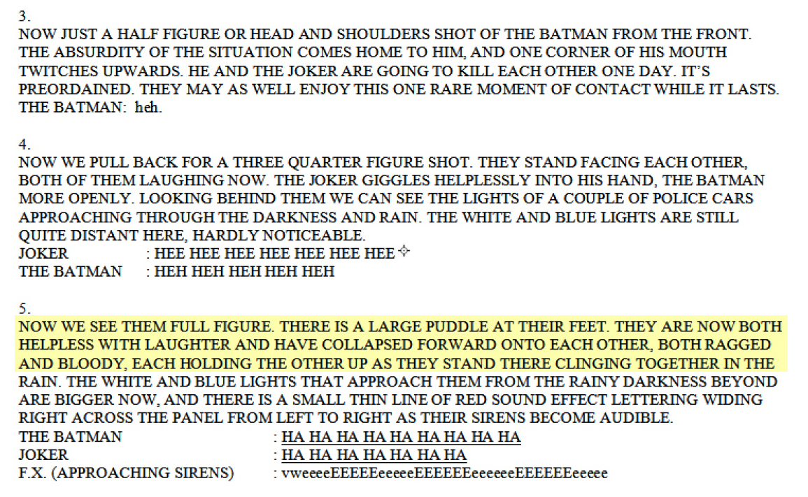
I find this take on it terribly exciting and if it isn’t what the original authors intended, maybe it should have been. Presenting the book as an origin story, and at the same time killing off the character on the last page is a great idea. The ultimate loop. But nowhere in Moore’s script (see below) does it hint to anything more than the two longtime adversaries leaning on each other in a quiet moment as they are allowed to laugh at the absurdity of their eternal struggle:
And if killing the Joker was intended, it might of happened in a very subtle fashion, perhaps as an in-joke just between the two creators that Bolland eventually let slip out in his 2008 intro to the re-edition. He hints at what Morrison mentions above – but Batman’s arm stretched out is clearly not on the Joker neck in the final illustration.
But all this fact checking doesn’t take away from the validity and impact of Morrison’s suggestion. In fact there is an odd tone to the story right from the beginning. Batman wanting to put a legitimate stop to their feud – obsessing over the idea of death and possibly putting into gears the self-fulfilling prophecy of one dying in the others arms.
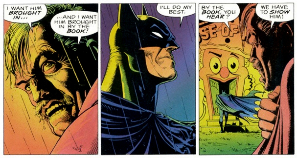
And it would, in a backwards way completely prove the Joker’s main point. That given the right circumstances people can be pushed to the edge, go crazy and burst out in violence. His broken neck would be the punch line to the joke that killed. The commissioner might have had a hint of this when he warns Batman that he wants the Joker brought in “by the book … in order to make him understand that our way works”. To which he gets the unconvincing reaction above.
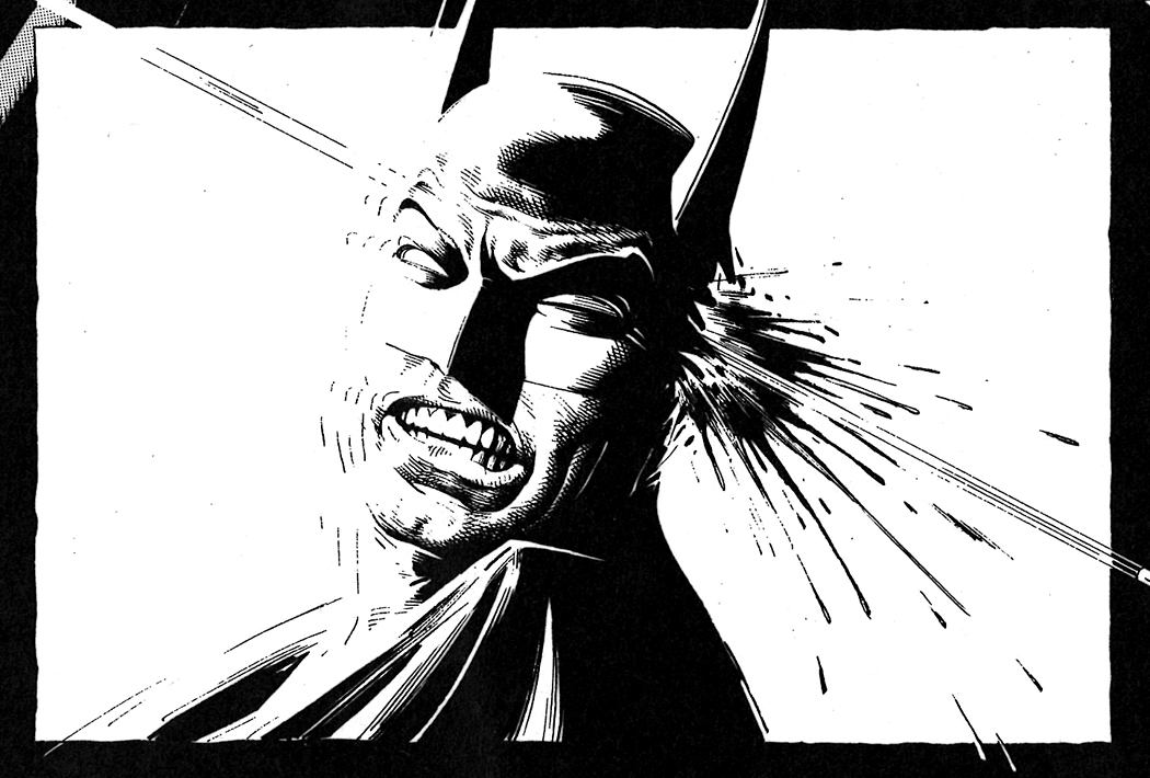
And it wouldn’t be the first time Bolland would be attached with a Gotham murder. He shoots Batman in the head in a short story he wrote and penciled in 1996. So maybe he is daring enough to pull a fast one on us all – it’s true that without the Joker around after the Killing Joke, having Batman is useless.
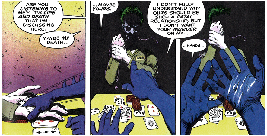
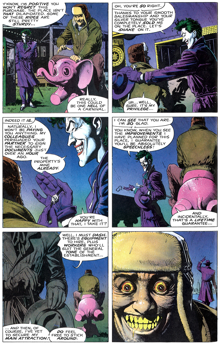
Favorite page (above): I love the pacing and classic grid system of the layout. Real Slow. The way Bolland gradually reveals all the elements of the joke, beat per beat. Pink elephant, handshake and weapon that land on the poisonous punchline. A hint of Joker’s madness is showcased as we see that part of his delight lies in the flirt and buildup. The ownership of the circus has already changed hands well before this chat, but he still strings along the owner as long as he can to meet up and talk. The yellow teeth and bulging eyes are the result of the deadly handshake attack, but not much of a challenge. Harder will be the trial up ahead – setting up the right circumstance for someone to end up with the same blank stare of psychological defeat, but getting there on their own without the old gag prop at hand.
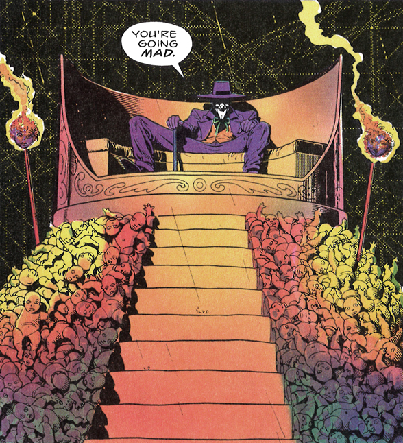
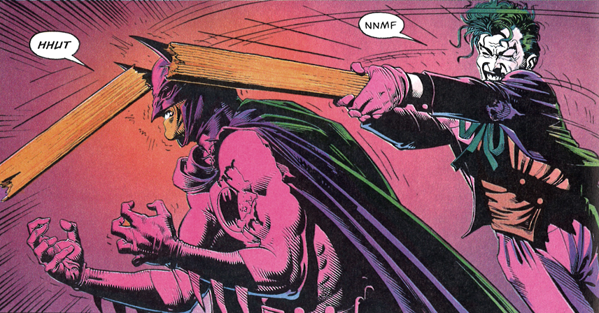
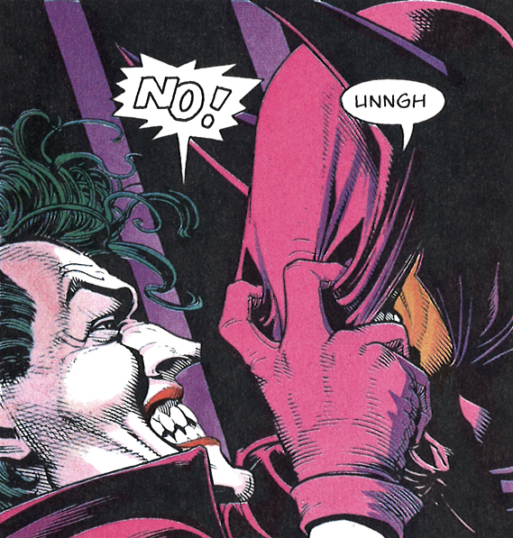
Favorite panel (above): Drenched in rich pinks and popping purples, I’m attracted in the image’s strength to underlining how ridiculous the idea of dressing up as a bat is – much sillier than dressing up as a clown. The bat mask sliding down, the Joker is in full swing unleashing years of unfair feelings of how his oddities have been vilified while Bruce Wayne’s championed. Both are as crazy as the other, one has found a socially acceptable way to focus his psychotic tendencies, while the Joker keeps getting put away. Both locked into a cycle of doomed patterns, needing one another to define themselves.
CRITICISM
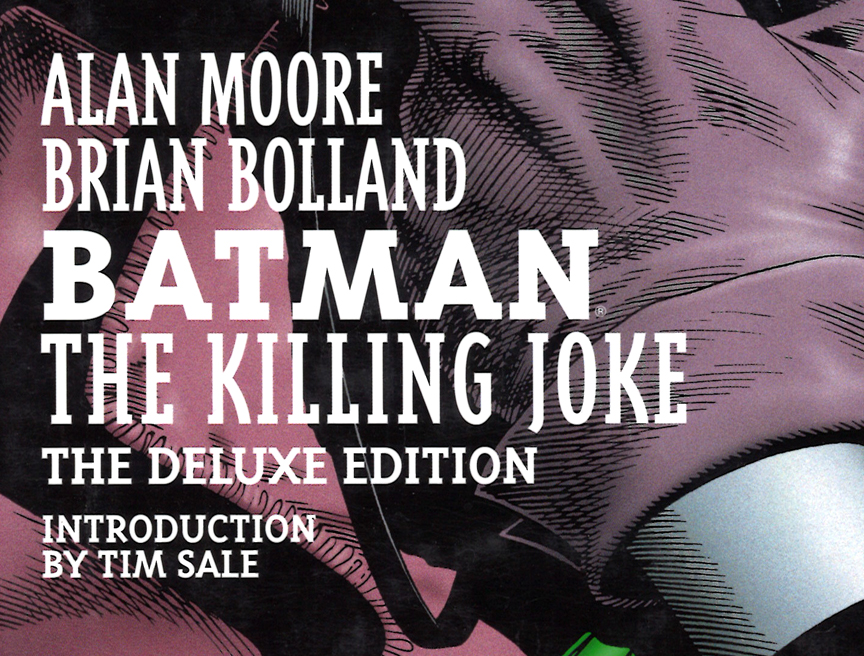
DC Comics released a deluxe edition of The Killing Joke in 2008. Bigger page size, new design and according to Bolland’s wish – was completely re-colored by the artist. Unfortunately none of it works as well as the original version, even down to the logotype re-design.
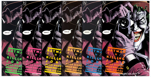
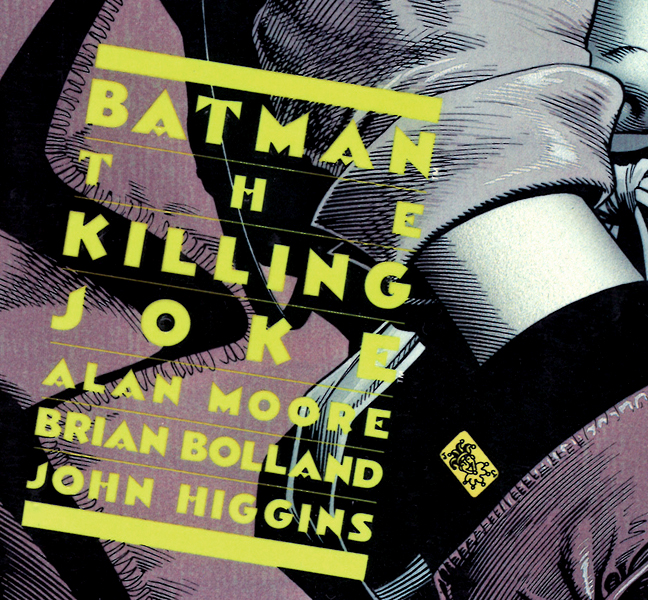
Graphic design: The original design credit (above) is given to Richard Bruning, who’s bold center aligned type layout brought a strong sense of branding in a medium that rarely allowed for sophisticated design work. As they went into further printings, the logotype changed colors – making the typography an active participant in the impact of the opening image. Smart stuff.
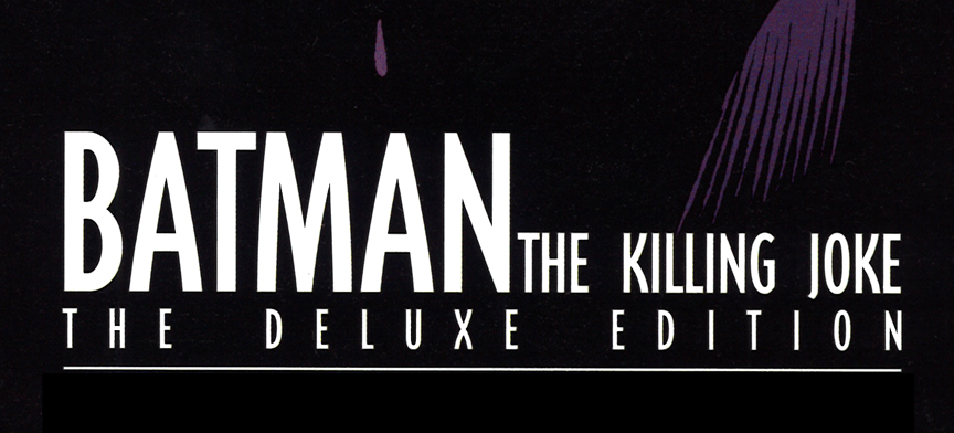
In comparison, the type design in the new deluxe edition seems dull and uninspired. On the cover (above – top) a bold slab serif font is mixed with thinner condensed typeface- a big step down from the original. The type design inside the book (above – bottom) doesn’t even match up with the cover, showcasing an even worst layout with a default looking font, bad kerning and terrible spacing considerations. Look how unbalanced the space (too tight) between “BATMAN” and “THE” is compared to the space after “THE” and “KILLING” … and how they forced the line under to align with “BATMAN” and “JOKE”, opening up the kerning in between the letters even more. None of it seems to be working together, none of it works. Which are also my feelings about Bolland’s recoloring job.
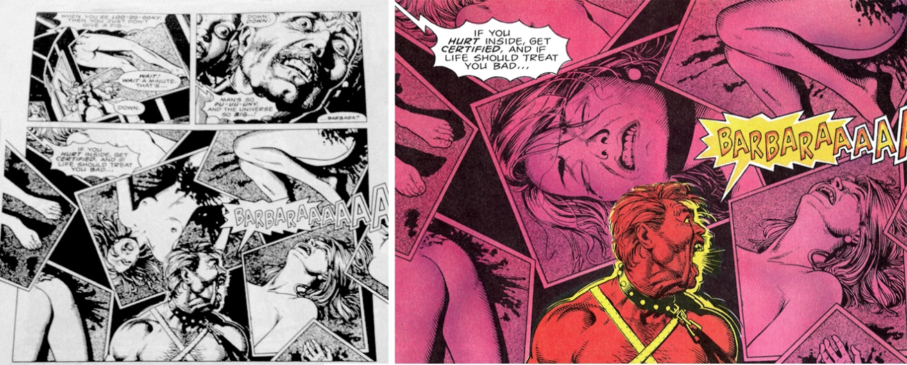
Coloring: The original colors by John Higgins have real flair, popping out on the page and giving an offbeat tone to the drawings. Bombastic and surprising at times, the dark tale is told in splashes of oranges, reds, greens and purples. While detractors say it shows signs of its time, I say the baroque palette elevates the hyper nature of the mania into a pseudo-psychedelic light show.
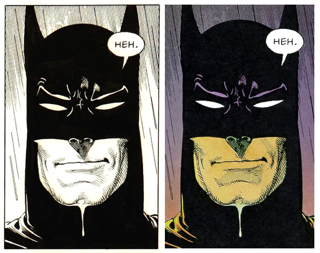
Bolland chooses to go in the opposite direction – stripping down the colors and bringing it all down to a more muted, lifelike palette (above right). I fully understand the exercise of trying to ground the visuals to a more realistic standstill in hopes of making the story even more palpable – but the end result lack vividness and excitement. Look how the original colors (above left) bring an urgency to the action, soaking them in a spastic fever dream. Something in the nature of the Joker’s character allows for the more frantic approach to work more effectively.
In Bolland’s revision, the flashbacks are contrasted with the story told in he narrative’s present tense by totally desaturating them of color. All black and white. The function of making a clear division between the two time-frames is not uninteresting, but it all seems too easy and somewhat cliché – like a bad TV show that makes the screen fuzzy to indicate a dream sequence, or black and white to indicate the “past” or a “reenactment”. He also adds another bothersome element by highlighting one color a la Schindler’s List that seems gimmicky and frivolous rather than helpful.
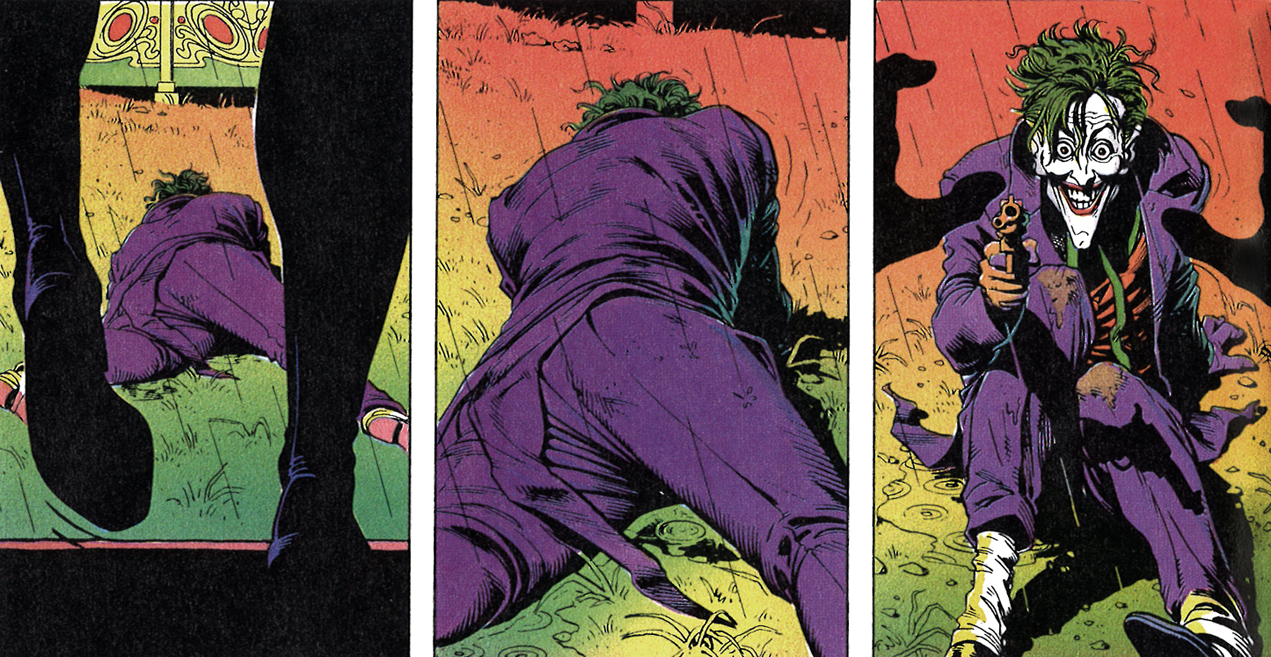
Bolland really layers on the gloss and Photoshop slickness when coloring lips in the book, especially for the the Joker (above right). It’s a micro detail and I guess it’s to add realism – but it has the opposite effect for me. Looks fake and sticks out like a sore thumb. Much prefer the elegance of Higgin’s more subtle colors and touch of white paint (left) to indicate a highlight.
And call me old fashion, but a pet peeve of mine in comics today is the homogenous look of computer coloring. Everything looks the same when flipping through mainstream action stuff. The hand rendered, sometimes hand painted craftsmanship is replaced with overly glossy, slick, web 2.0 soft gradients and machine-like thinking. Not all of it is bad, but enough to look back at some of the pre-computer color designs, however primitive they were with a certain amount of affection. Look at how the grassy background on the left is highlighted and accentuated with tone and texture in the original – seeing the human touch of the brushmarks completely affects the mood.
I’m really curious to know what was behind Higgin’s process for a panel like this – it seems like a mix of older CMYK plate color techniques with slight painterly touches on top (above left). Not 100% sure. The background gradient seems like an airbrush effect, layer of purple looks like a more traditional flat color plate and Batman has touches of what seem like had painted brush details. Love the small splash of white on his chest, really adds personality – something the Bolland’s recolored version on the whole (right) is lacking. The design, coloring and vision of the original was better left alone.
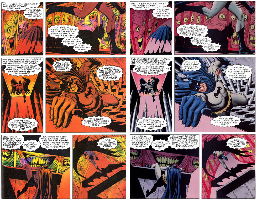
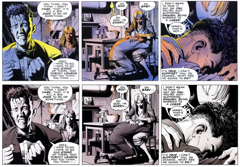
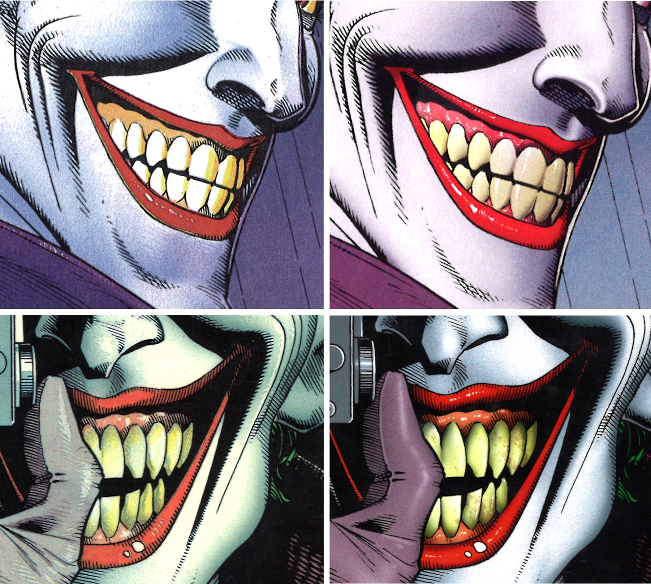
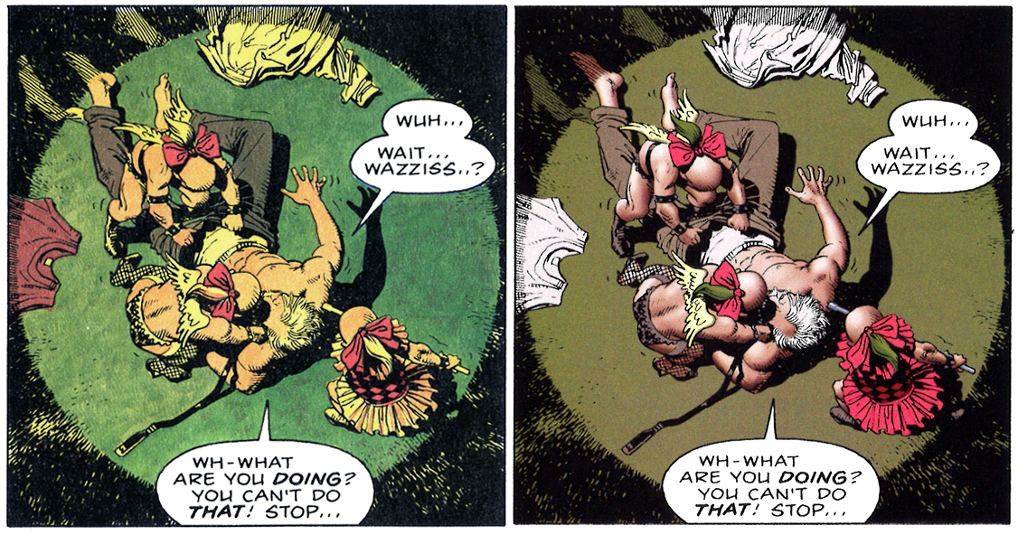
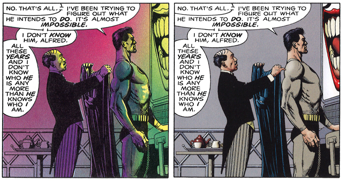
Regarding the Higgins vs Bolland colouring: Higgins demonstrates actual knowledge of the proper placing of light sources and the effects of harsh colour mixing on the perception by the human eye, while Bolland seems not to have a clue. When placed in a dark harsh light like in a amusement park funhouse, even the Batman’s costume will take a tinge of orange and not look like an action-figure packaged in a department store (Boo on tossing the yellow oval on the chest emblem, too!). Same with a spotlight coming from an aged lamp, or when The Batman is standing in front of a monitor screen in a dark cave. And I agree that the black-and-white flashbacks and the Schindler’s List “one element in colour” gimmick come off as lame clichés. Bolland’s colour choices seem fixated on what they actually are if you think about them in a vacuum, while Higgins choices are dictated on what they would be in the context of the story. The only places where Bolland’s colouring is better are in the closeups, where light sourcing placement matters less.
Regarding Grant Morrison’s interpretation of the ending, with the Batman throttling and breaking the Joker’s neck: Morrison’s interpretation only makes sense if you have forgotten or (more likely, in Morrison’s case) willfully or conveniently ignore the three pages before the Joker’s flashlight joke, The Batman (who didn’t have a particularly bad day that day to snap then — it was Gordon whom the Joker was trying his macabre social experiment on) goes on an extended session of outreach to the Joker to avoid a scenario where he kills the Joker. And the Joker point-blank asks the Batman: “I shot a defenseless girl. I terrorized an old man. Why don’t you kick the hell out of me and get a standing ovation from the public gallery (like Grant Morrison)” and the Batman answers (echoing Gordon’s earlier pleadings, and clearly showing he listened to and is heeding them) “Because I’m doing this one by the book… …And because I don’t want to.” It seems like quite a (likely drug fueled) leap of faith or severe wish-fulfillment to see the Batman suddenly snap on the last page of the story.
Moore has gone on record, back when the story first came out, saying the story of The KIlling Joke is the kind of nice but un-profound story you might find in an old Batman Annual, though immensely more harshly violent, given the newness of the hard-core take on superheroes that was going on at the time. The story is pretty much a typical and un-complicated Batman versus Joker confrontation at its core (or any hero/nemesis confrontation for that matter) but is extremely well-told.
– Regarding the Higgins vs Bolland colouring: Higgins demonstrates actual knowledge of the proper placing of light sources and the effects of harsh colour mixing on the perception by the human eye, while Bolland seems not to have a clue. When placed in a dark harsh light like in a amusement park funhouse, even the Batman’s costume will take a tinge of orange and not look like an action-figure packaged in a department store. Same with a spotlight coming from an aged lamp, or when The Batman is standing in front of a monitor screen in a dark cave. Bolland’s colour choices seem fixated on what they actually are if you think about them in a vacuum, while Higgins choices are dictated on what they would be in the context of the story. The only places where Bolland’s colouring is better are in the closeups, where light sourcing placement matters less.
You absolutely nail it here, great incite. I wish I had written that in my piece!
– Regarding Grant Morrison’s interpretation of the ending, with the Batman throttling and breaking the Joker’s neck: Morrison’s interpretation only makes sense if you have forgotten or (more likely, in Morrison’s case) willfully or conveniently ignore the three pages before the Joker’s flashlight joke,
As mentioned in my post I think the factual evidence that the Batman kills the Joker at the end is slim and I don’t fully subscribe to it – but the suggestion of it all has really sparked my imagination. It might not be there on the page, but I like Morrison’s creative projection of it all. It is, for me as interesting if not more than the original work. And let’s not forget, it’s Bolland himself in the re-edition that hints at it all, Morrison is not alone – he has the original creator winking at us about it all too.
– The Batman (who didn’t have a particularly bad day that day to snap then — it was Gordon whom the Joker was trying his macabre social experiment on) goes on an extended session of outreach to the Joker to avoid a scenario where he kills the Joker.
If we jump on board Morrison’s suggestions it could be interesting to explore the idea that it was on Batman that the Joker was trying an experiment on, not Gordon. Batman is the nemesis here, but his altruistic nature makes him a hard target to make a dent on. Nothing done directly to him will be effective. If the Joker wants to get to Batman, he gets to him through Gordon. So in this scenario Batman has had a really bad day (people close to him are being hurt) and is ripe for the experiment.
– And the Joker point-blank asks the Batman: “I shot a defenseless girl. I terrorized an old man. Why don’t you kick the hell out of me and get a standing ovation from the public gallery (like Grant Morrison)” and the Batman answers (echoing Gordon’s earlier pleadings, and clearly showing he listened to and is heeding them) “Because I’m doing this one by the book… …And because I don’t want to.”
Agreed. But Batman has been oddly death obsessed from page one – pontificating on the day “this all ends, that one kills the other”. In Moore and Bolland’s hands this is no ordinary batman story, something ominous and dark is lurking that hasn’t before. He tries it by the book first, then when that fails does otherwise. His “I’ll do my best” reply to Gordon when he orders this one done “by the book” has a strange and unconvincing feel to it – he seems preoccupied by its true implications this time around. But yes, it is against Batman’s character to cross that line – and seems unlikely. But maybe that is the whole point.
– It seems like quite a (likely drug fueled) leap of faith or severe wish-fulfillment to see the Batman suddenly snap on the last page of the story.
Choosing an older man doesn’t seem like a very ambitious target to anchor his big experiment on, but Batman yes – the ultimate symbol of moral solidity. Make HIM snap and you’ve proved your point. It’s a complete suicide mission. The brutality of the violence inflicted in the story is above and beyond any other Batman story of its time – it needed to cross that line. If he is kept alive, senseless acts of brutal violence will continue. If done by the book and put in jail, he will escape (like the story sets up at the start). The Joker declines the offer for real help …
Batman snaps.
Joker is killed.
Joker’s point is proven.
It’s the Joker origin story that ends with his death. The complete loop.
– The story is pretty much a typical and un-complicated Batman versus Joker confrontation at its core (or any hero/nemesis confrontation for that matter) but is extremely well told.
I don’t think any of the above that we are discussion is particularly complicated, so I would agree and say that an extremely well told and uncomplicated confrontation between a hero / nemesis is exactly what I am looking for when reading superhero, action, adventure comics.